How to: Set up a Form Experience
This article describes how to set up a simple sign-up form. A sign-up form allows you to collect data from your customers such as full name, email address, birthday, and more.
Getting started
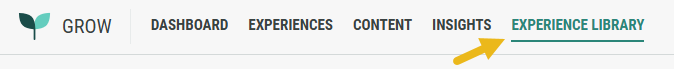
- Navigate to the Experience Library in the Top Navigation bar.
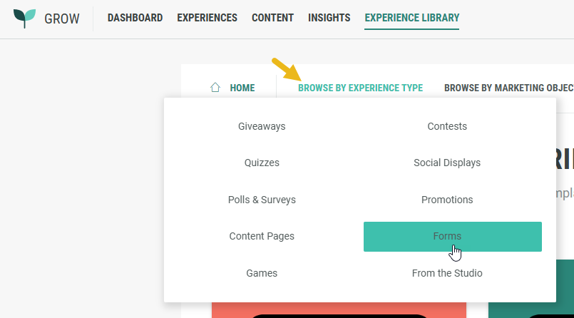
- Click on Browse by Experience Type, and select Forms.
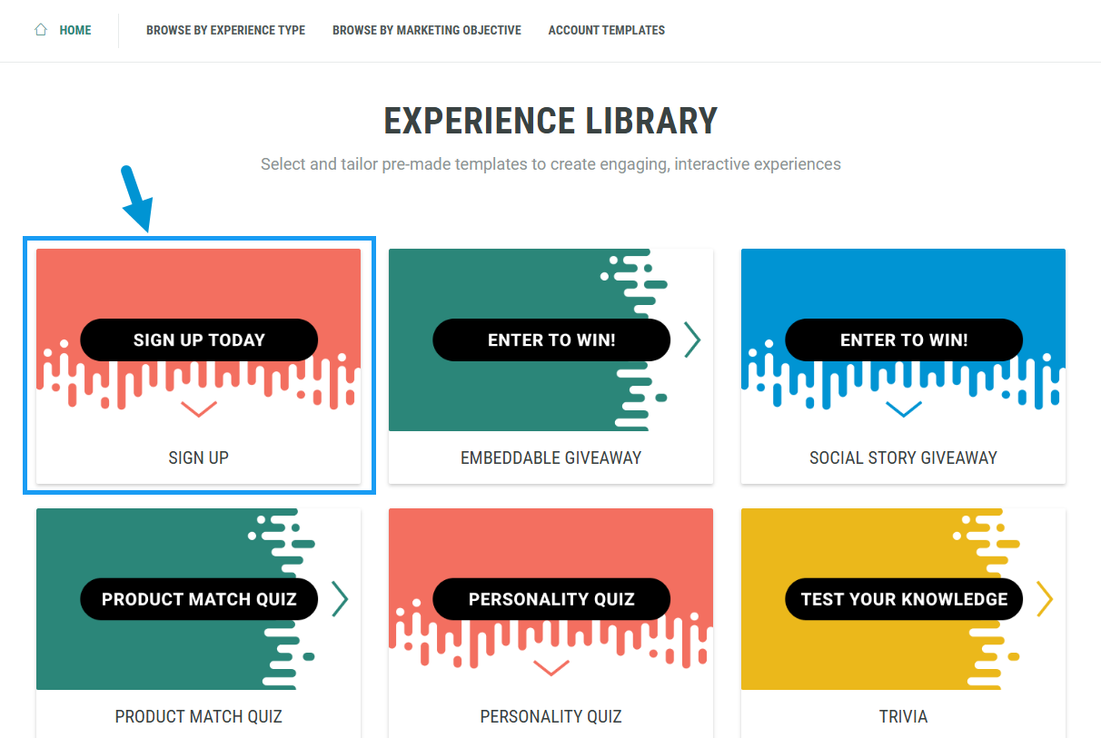
- Select the Nextgen Sign Up Experience.
- Click Create +.
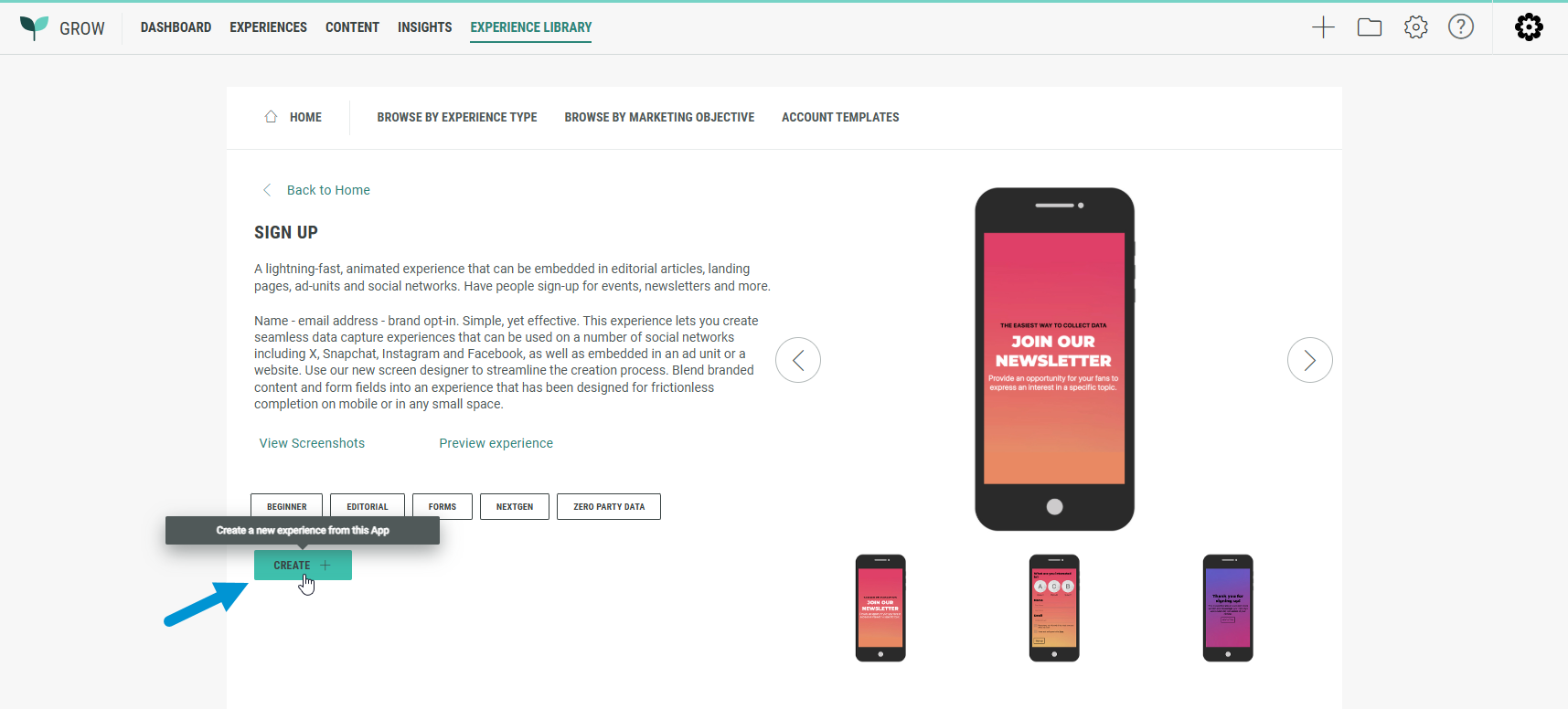
- A wizard takes you through the Experience creation process.
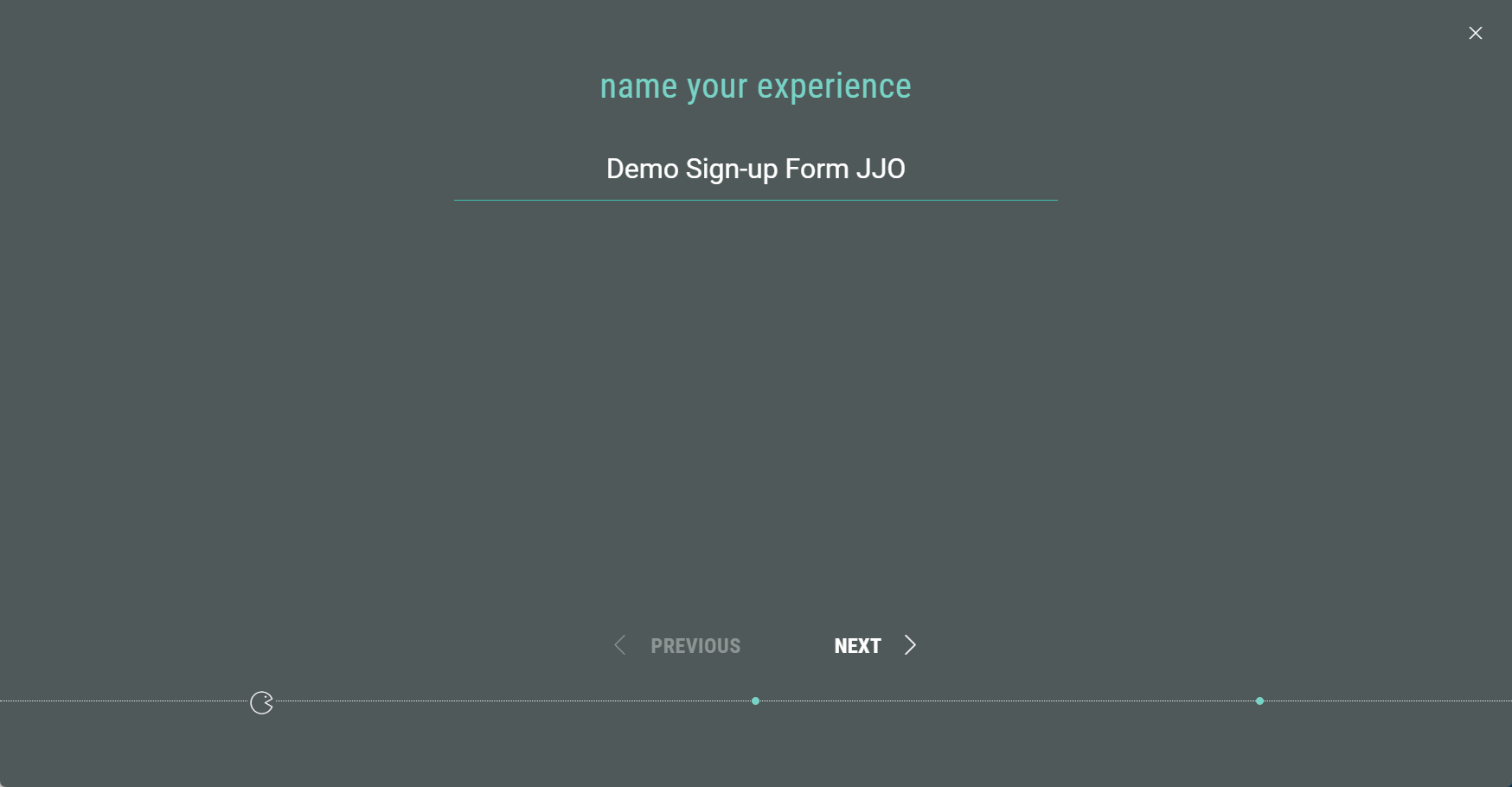
First of all, name your Experience, then click Next.
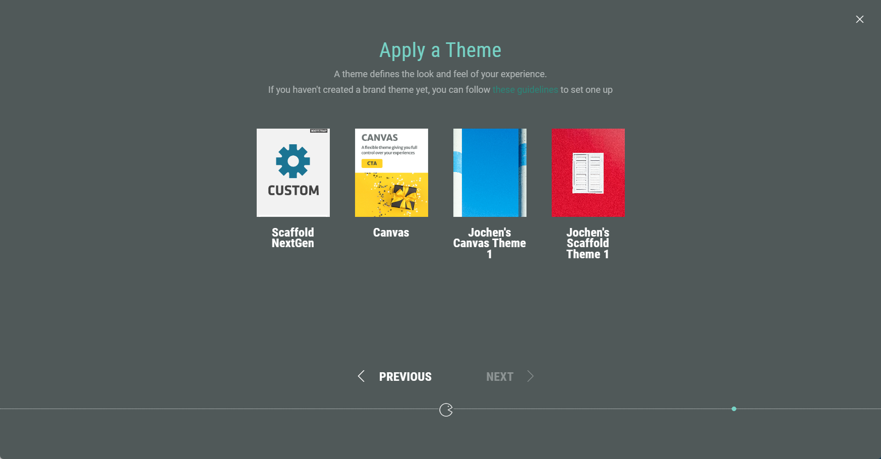
- Choose a theme. You can select one of our foundation themes (Canvas or Scaffold) or your brand theme if your account has one (or more) configured. The theme determines the look and feel of your Experience. Then click Next.
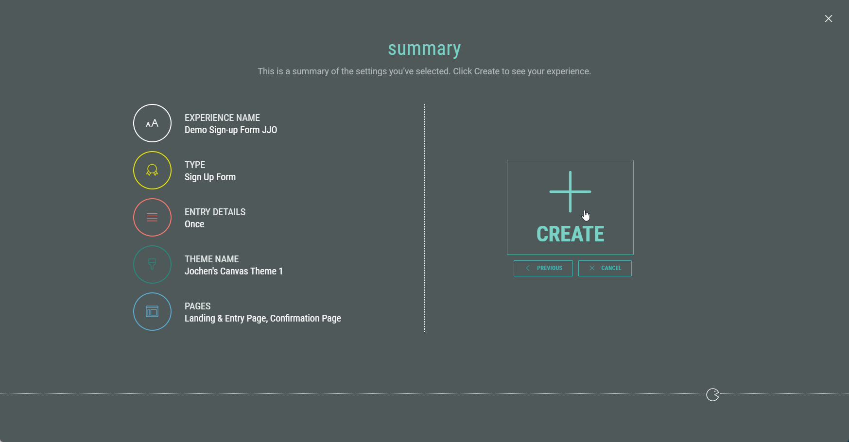
- Finally, you're presented with an overview of the Experience setup so far. If you’re happy, click Create to finalize your settings and create the Experience.
Customizing your Experience
Once you have completed all the steps in the wizard, you land in your Experience area. Here you find several tabs to work through in order to build, design, and publish your Experience.
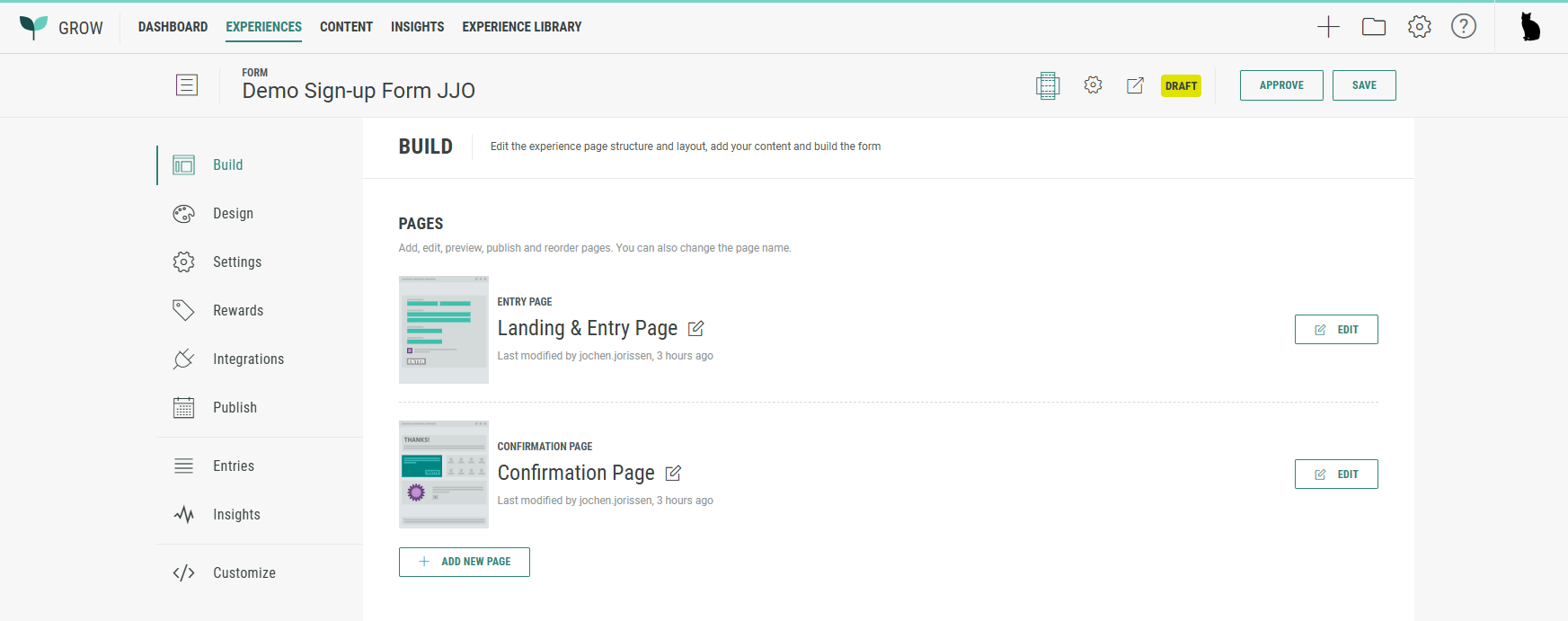
Build tab
Landing & Entry Page
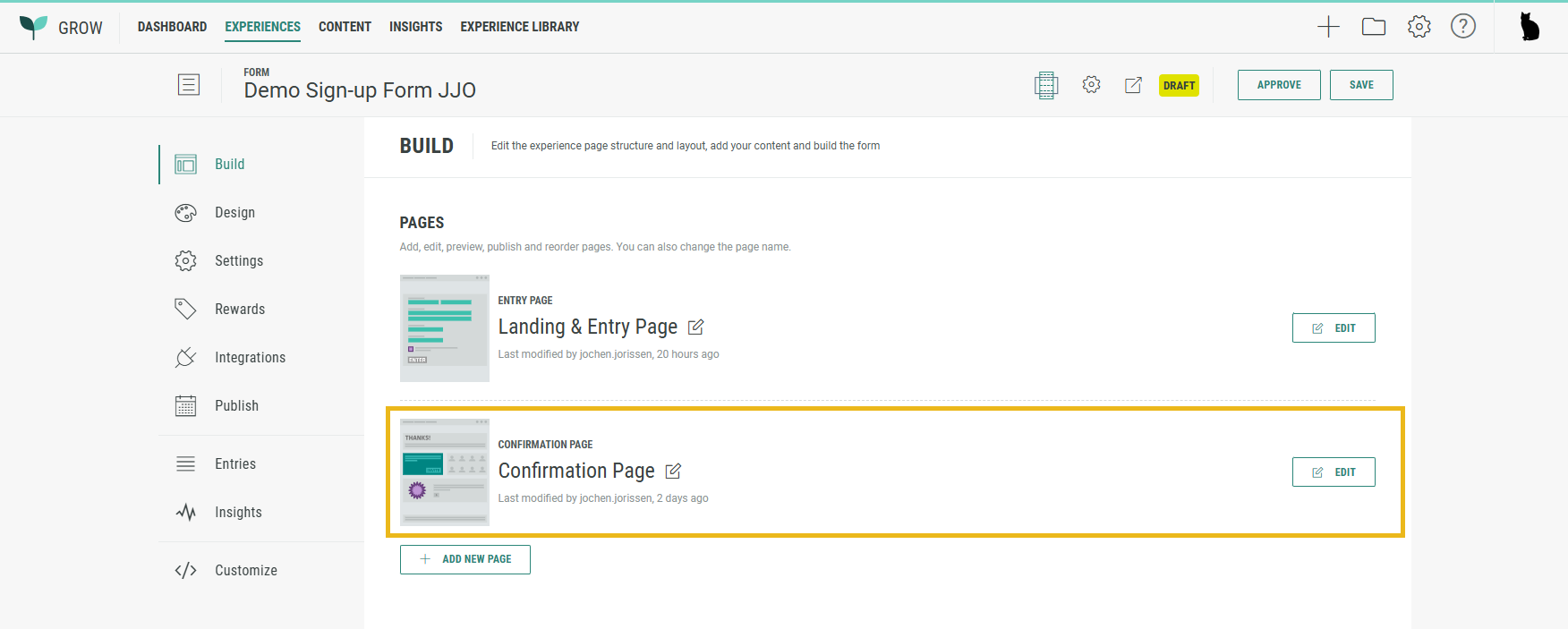
The Build tab offers an overview of the pages included in your Experience. Our sign-up form comes with a Landing & Entry Page and a Confirmation Page.
The Landing & Entry Page is the first page Experience entrants will see, where data capture takes place.
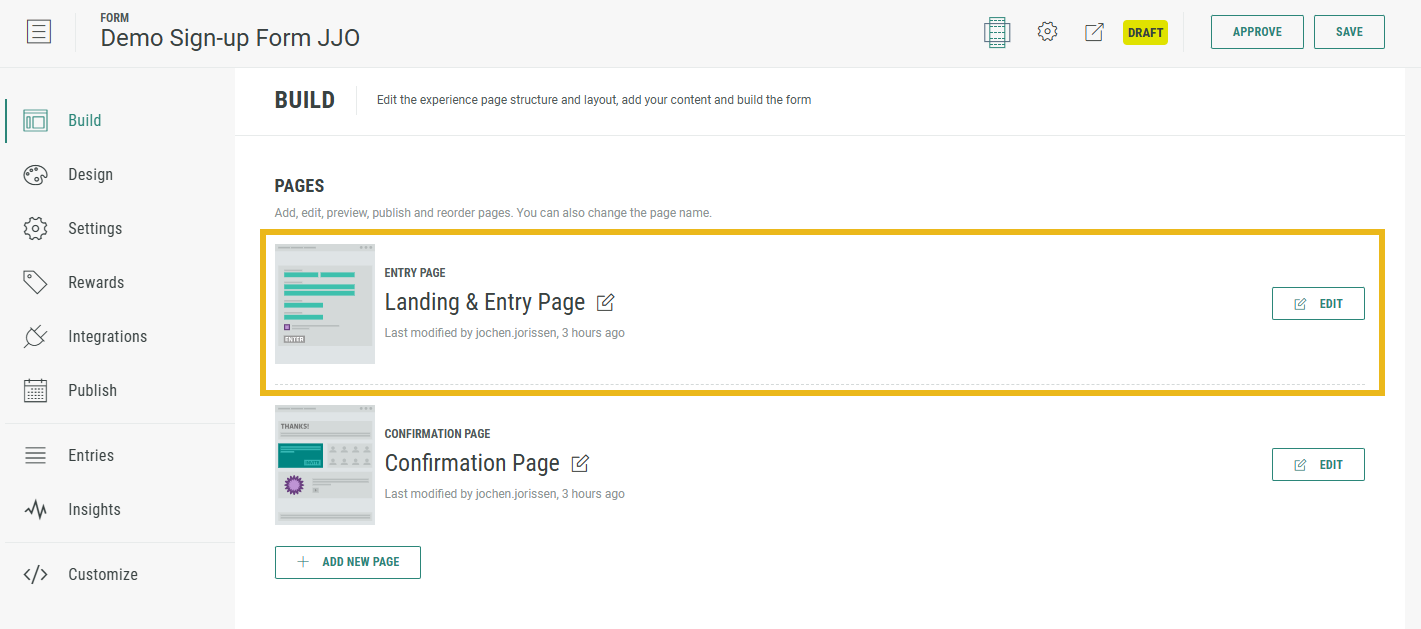
- Click on the Edit button at the right of the Landing & Entry Page to enter the Page Builder.
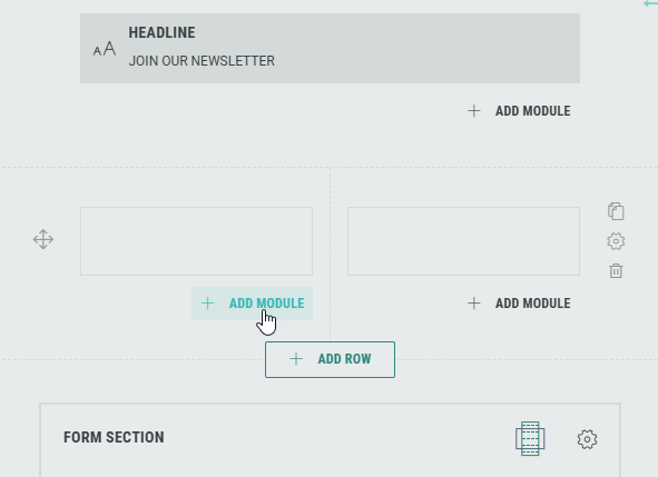
- The Sign Up Form Experience contains a Form section with some form elements by default, such as a Single Choice module, Name input field(s), and an Email address input field.
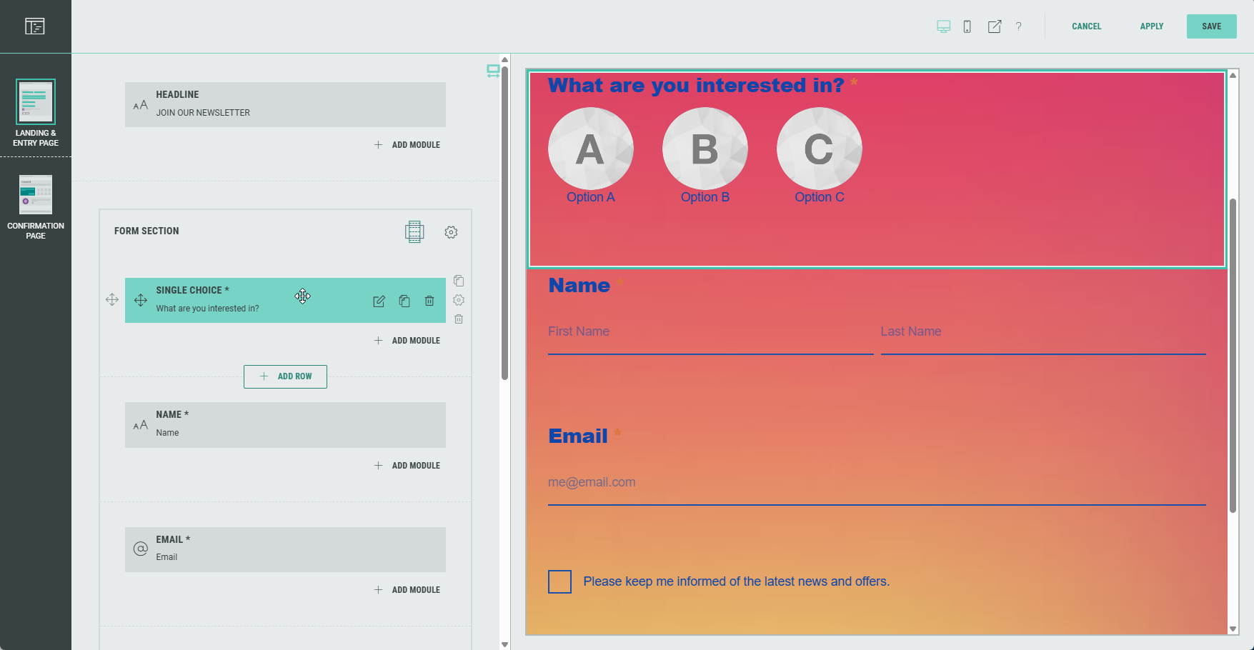
Note: Hovering over any of the elements on the left with the mouse cursor will auto-scroll and highlight the corresponding element in the preview on the right, and vice versa.
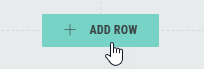
- You can add rows by clicking on the + Add Row button (that appears underneath each existing row section).
- You can add modules by clicking on the + Add Module button that appears in each row (and in each column for a multi-column row layout).
Note: You can add, edit and delete modules, and customize each module for your Experience.
Form modules can only be added in the Form Section.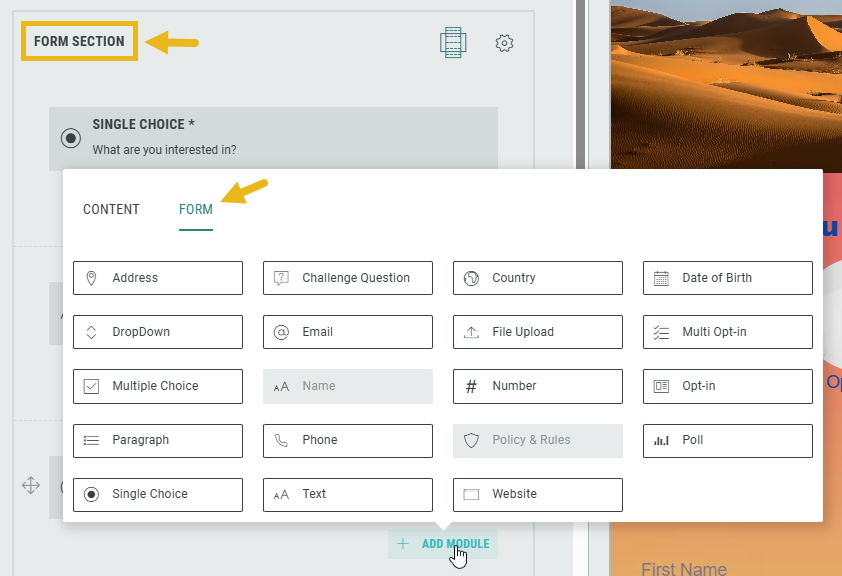
- Within the Form Section you can click on the Gear icon to access the Form Settings.
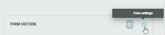
In the Form Settings, you have the ability to customize the form such as adding a background image and color, and changing the field style. Consult this topic for more info on the Form Section.
Note: On the Advanced tab in the Form Settings, you can define a Customer ID for linking data collection to the correct user profile. More info on this subject can be found here.
- Now let's configure the default Form Section modules.
Note: You can add and configure additional modules as desired, and delete modules you don't need.
Configure default Form Section modules
Single Choice module
Let's configure the Single Choice module first.
This module will ask the Experience entrants to select an answer from a number of possible options to a question we'll ask them.
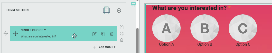
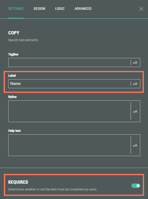
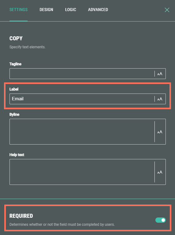
- In the Single Choice module settings, add a label and determine whether or not the field must be completed by participants.
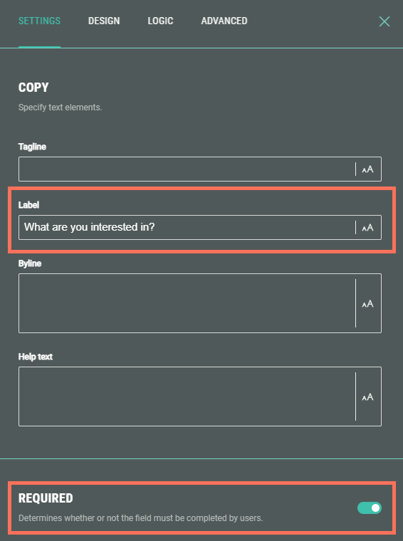
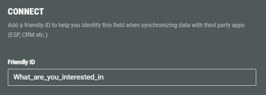
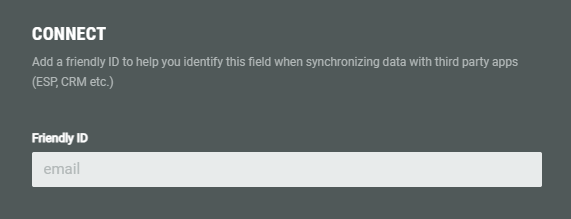
- Make sure that you set a Friendly ID in the Connect section.
The Friendly ID is used to help identify this field when synchronizing data with third party apps (ESP, CRM etc.)
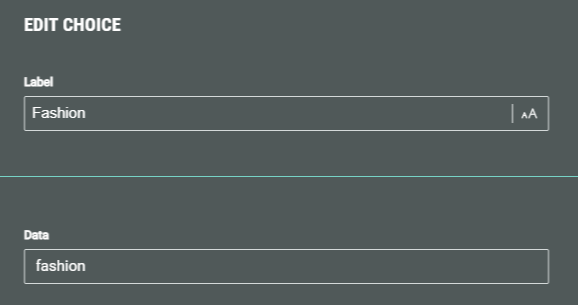
- Then, configure each option. Click the Edit Choice icon next to an option to access its settings.

- For each option, set the label and data attribute.
Values assigned to the data attribute are stored in the customer profile (for example, streetwear for fashion, or blue for favorite color). The data attribute gets automatically populated when you fill in the label for the first time.
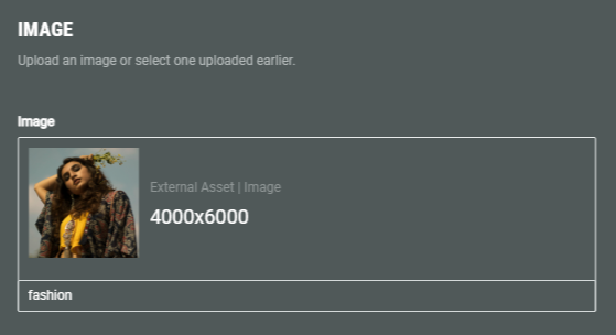
- If desired, you can add a thumbnail image to illustrate the option, and set an image alt text.
Select an existing image from your asset library (which contains your uploaded assets) , from Pexels or from images uploaded within the Experience.
Or upload a new one (within the Experience).
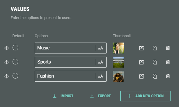
- The options for the Single Choice module could then for example look like this:
- Additionally, as for other modules, you can configure the design (look and feel) of the single choice options, define any conditional logic (when applicable), and set an error message on the advanced tab for when no selection is made.
Example: Preview of the single choice options.
Name module
Next, configure the Name module.
This module will ask the Experience entrants to enter their name in an input field.
- Add a label and determine whether or not the field must be completed by participants.
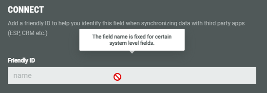
- The Friendly ID is fixed (read-only) for this field.
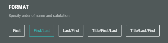
- Specify the format of the name field(s).
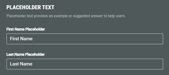
- Set the placeholder text for the name field(s).
- Additionally, as for other modules, you can configure the design of the field, define any conditional logic (when applicable), and set advanced error messages for when the input is invalid or when the field is left empty.
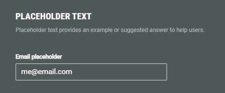
Example: Preview of the name fields with their placeholder texts.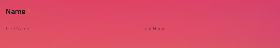
Email module
Next, configure the Email module.
This module will ask the Experience entrants to enter their email address in an input field.
- Add a label and determine whether or not the field must be completed by participants.
- The Friendly ID is fixed (read-only) for this field.
- Specify the placeholder text.
- Additionally, as for other modules, you can configure the design of the field, define any conditional logic (when applicable), and set advanced error messages for when the input is invalid or when the field is left empty.
Note: In the Advanced settings of the Email module, as an additional email verification, you can ask the Experience participants to enter their email address twice to reduce entry errors.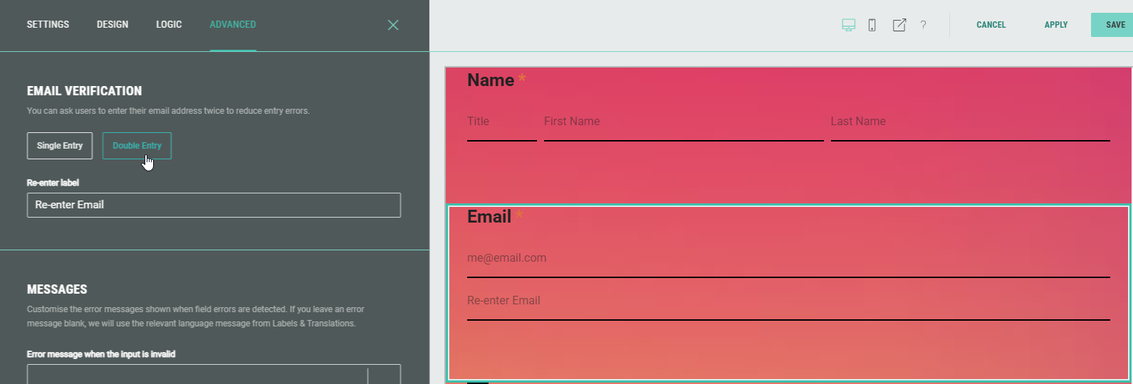
Opt-in module
Next, configure the Opt-in module.
This will present a checkbox to the Experience entrants to choose whether they give their permission or not to receive any follow-up communication from your brand in the future.
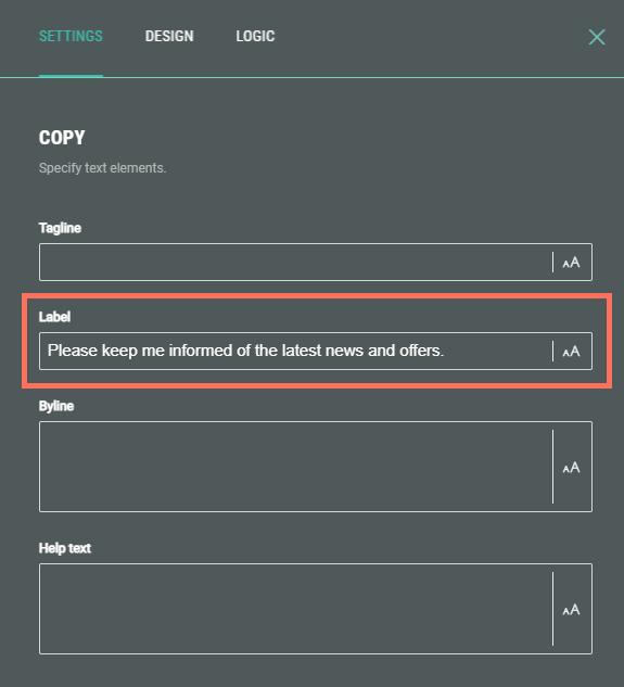
- Add a label.
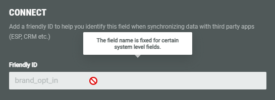
- The Friendly ID is fixed (read-only) for this field.
- Select the marketing scope (permission level) that best suits this opt-in request: Brand, Group or Third Party. (Each opt-in scope may exist only once on a given form.)
The Friendly ID above automatically gets the value brand_opt_in, group_opt_in or third_party_opt_in, depending on the selected marketing scope here.
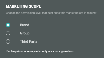
Note:
The marketing scope implies that the Experience participant agrees to receive marketing communications:
- from the specific brand they're interacting with.
- from multiple brands within the same parent company (=group).
- from external companies unrelated to the brand or its parent group (=third party).
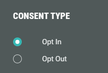
- Choose the consent type:
- Opt In — When the Experience entrant ticks the checkbox, they will keep on getting future digital communication, such as offers and newsletters.
- Opt Out — When the Experience entrant ticks the checkbox, they will not receive future communications at all.
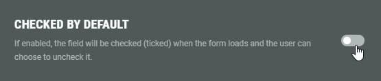
- Select if the checkbox should be checked by default.
If the toggle is enabled, the field will be checked (ticked) by default when the form loads. The entrant can choose to uncheck it.
- Additionally, you can configure the design of the field, and define any conditional logic (when applicable).
Example: A checkbox of type opt-in, that's ticked by default, to receive future communications.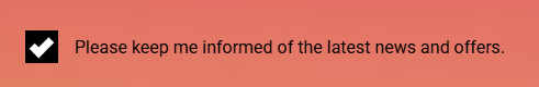
Policy & Rules module
Next, configure the Policy & Rules module.
It allows you to add a statement containing links to URLs for Terms & Conditions and Privacy Policy, as well as specific Rules.
For our example, we add a simple Privacy Policy statement.
- On the Settings tab, enter Policy Statement text in the field, then highlight some of the text and click on Privacy to make it a Privacy link.
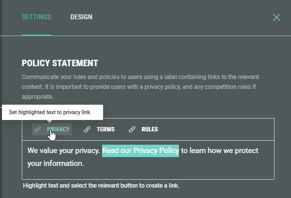
- Then enter the Privacy URL containing your detailed Privacy Policy info.
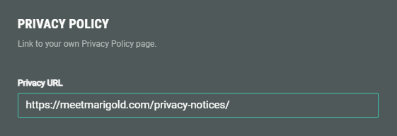
The Experience entrants will be directed to the Privacy URL when clicking the linked text in the policy statement.
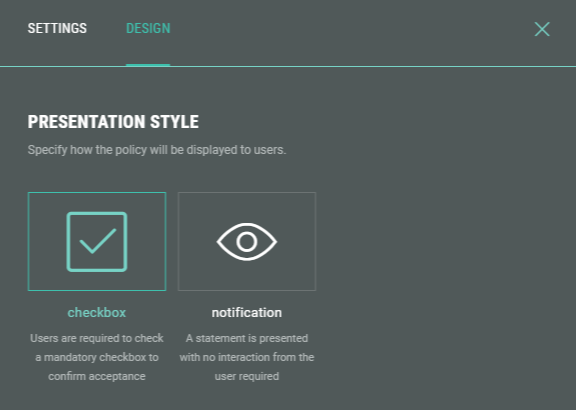
- On the Design tab you select the policy's presentation style.
This can be either:
- a checkbox, which requires entrants to check to confirm they have read the policy, terms, and/or rules.
- a notification, which doesn't require entrant confirmation.
Note: Detailed info on the Policy & Rules module can be found in this dedicated topic.
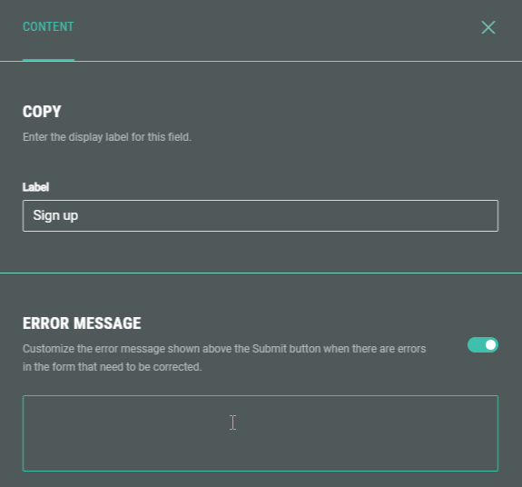
Submit module
The final default module is the Submit module, to confirm and send the completed form. It appears as a button.
Enter a button label, and if desired, customize the error message that appears when the form contains errors and can't be submitted.
Example of a complete Form Experience Landing & Entry Page:

Confirmation Page
Below the Landing & Entry Page, you can see the Confirmation Page.
The Confirmation Page is the final page of the Experience. Typically, this page is used to show a thank you message or a reward to entrants once they have completed the form. It's displayed as soon as they hit the form submit button.
- From the Experience Build tab, click on the Edit button at the right of the Confirmation Page to enter the Page Builder.
Note: When you're already inside the Page Builder, you can switch between pages on the left.
Click on the Confirmation Page to edit it.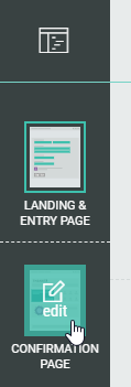
- The Confirmation Page already contains a Callout field.
You can edit, copy, or delete it.
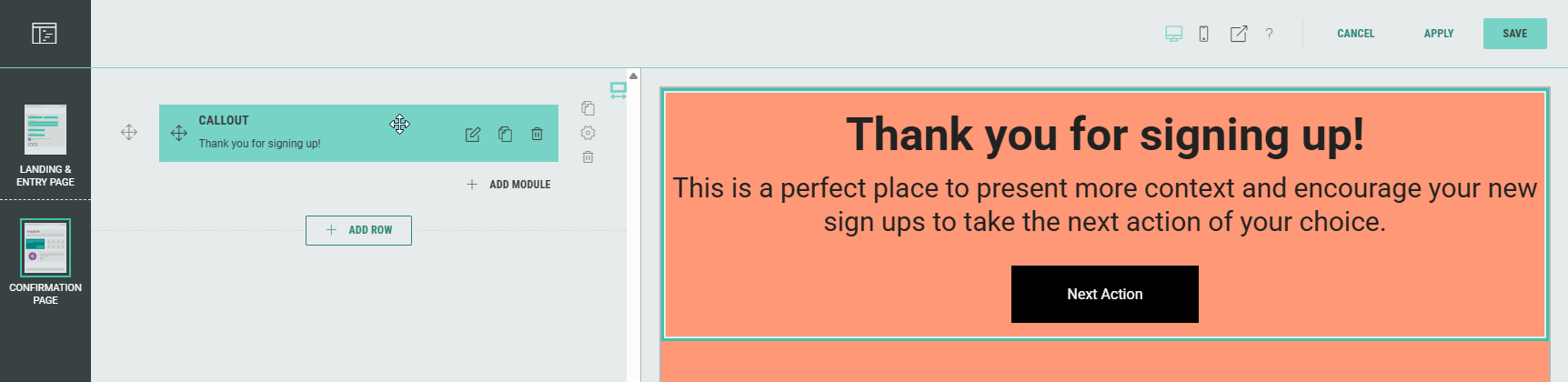
- As with the Landing Page, you can add, edit, and delete rows and modules to customize your Experience.
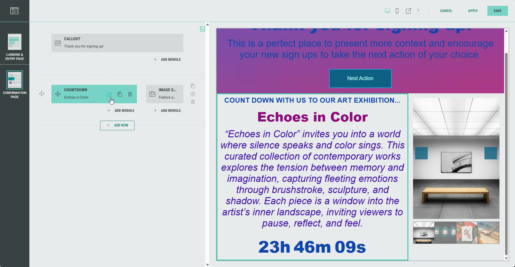
Note: Don't forget to save your changes (see Page Builder actions here).
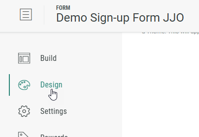
Design tab
The Design tab can be found directly below the Build tab. Here, you can continue to customize your Experience with the Display Type (Page- or Slide-based), change or edit the Theme, and add a footer and background in the Page Structure and Design section.
Note: More info on the Design tab can be found here.
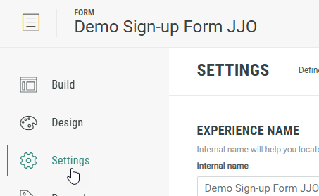
Settings tab
On the Settings tab, you define and edit the key settings for your Experience.
Note:Here you can find more info on the Settings tab.
Rewards tab
A Reward is an incentive offered to customers for participating in a Grow Experience, with the ultimate goal of learning something new about that customer or driving engagement with your brand. Rewards, like prizes, offers, or coupons, can be provided in real-time and have been shown to boost overall engagement. They can be structured as everyone wins or with set odds with consolation rewards as an option. Inclusion of a reward in your experience will boost participation.
Note: More details on Rewards can be found here.
Publish tab
Once you're happy with the setup of your Experience, you can move on to the Publish step.
We offer 3 ways to publish your Experience.
You can either embed it on your website, host it within a pop-up, or publish as a landing page.
Note: Here you can read more about the publish options to make sure you pick the right one for your business needs.